Brand & Web Design. Front-End Development

The project scope was to build SmartDesign’s website and develop its brand, in order to establish the company’s online presence and allow it to showcase its portfolio of projects.

1

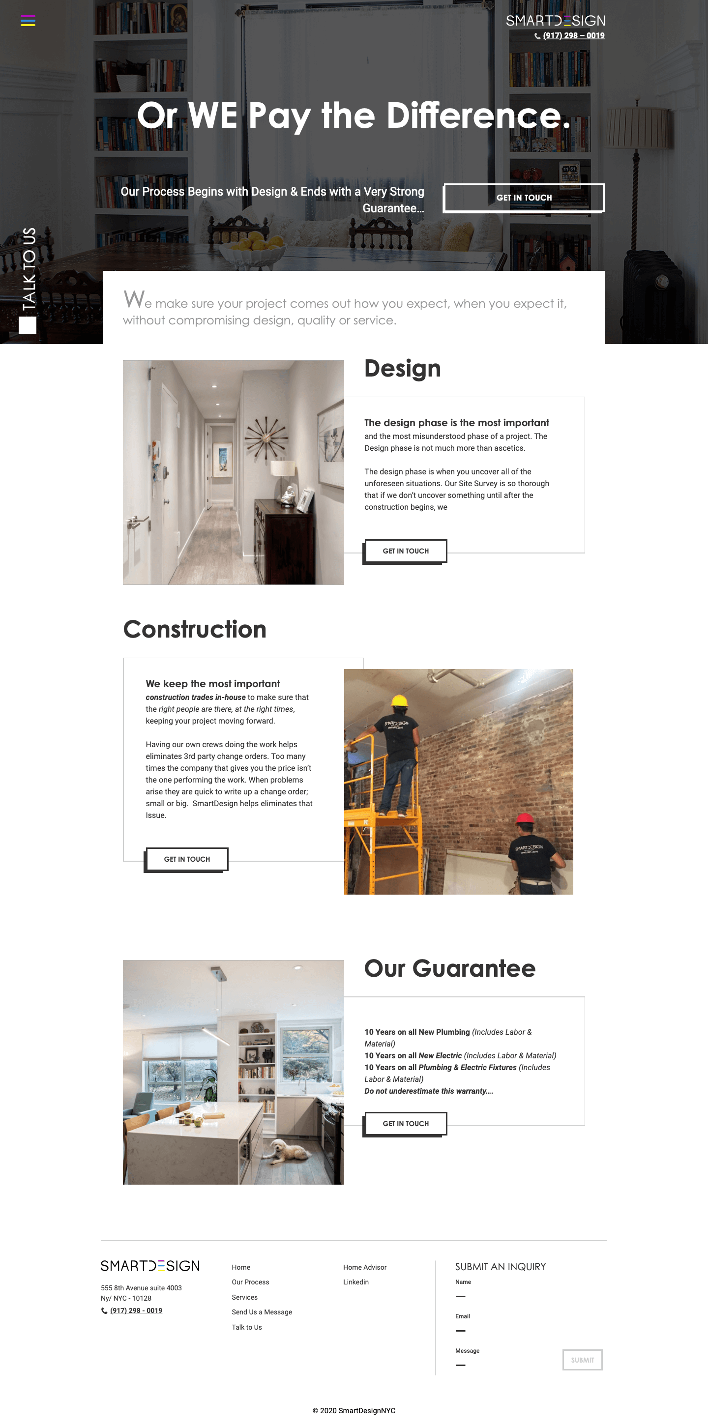
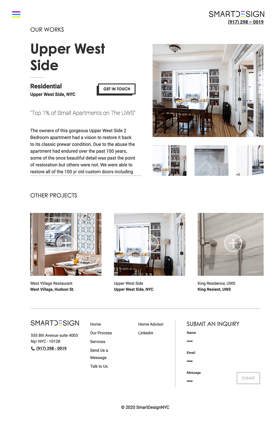
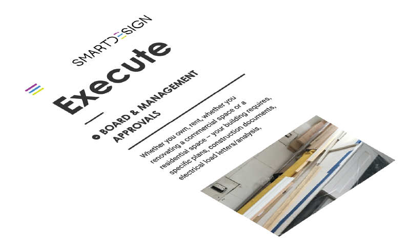
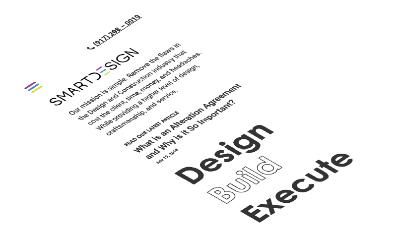
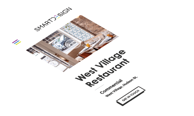
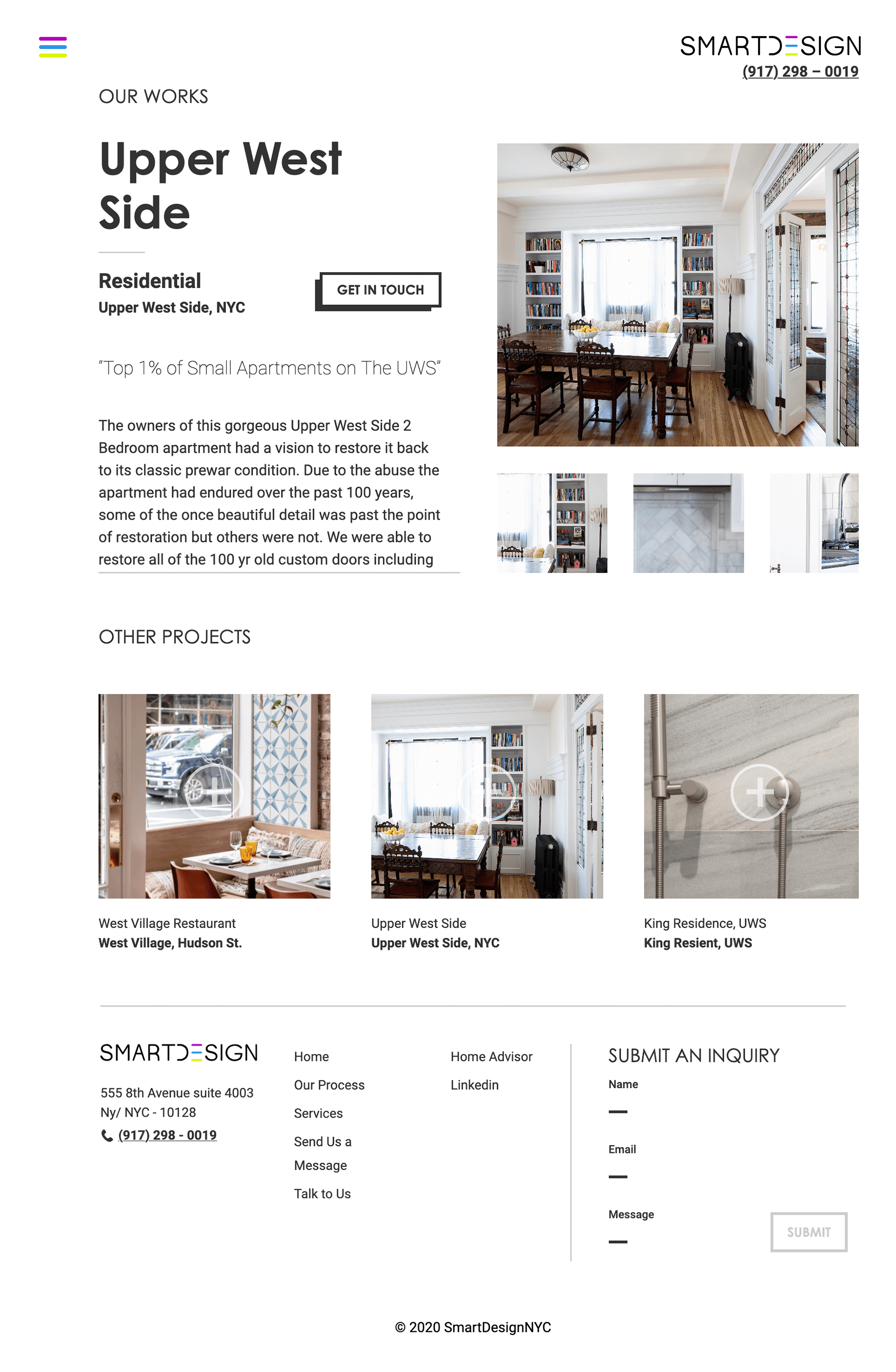
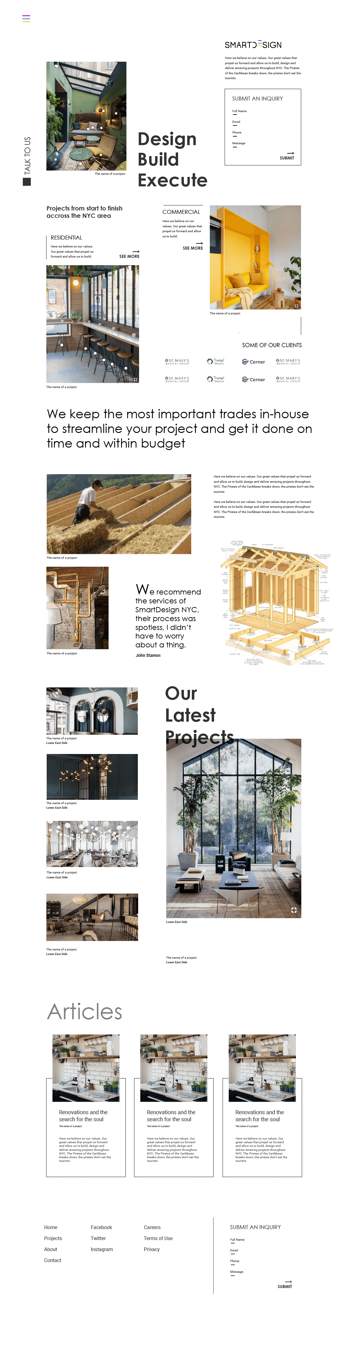
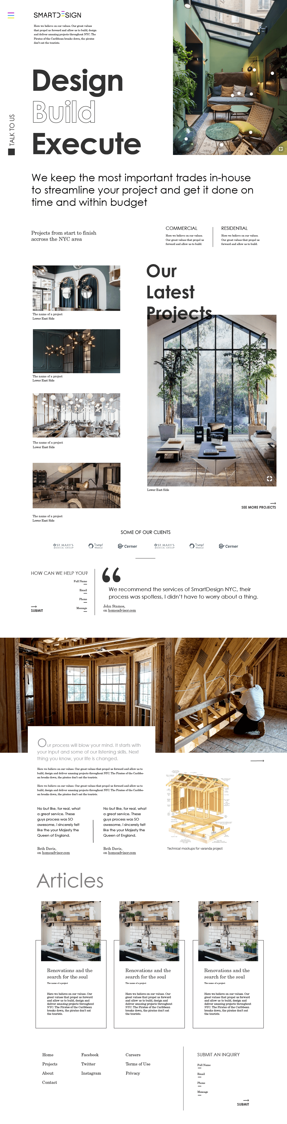
Concept & Research Concept & Research

The project began with exploration of different visual concepts for the website. To work as a display of projects and services, it needed to be able to frame the company’s imagery around its values of sophistication and effectiveness. Through research and the creation of early prototypes, we arrived at a minimalistic syle that combined widespread use of whitespace, large pictures, and prominent typography.

The project began with exploration of different visual concepts for the website. To work as a display of projects and services, it needed to be able to frame the company’s imagery around its values of sophistication and effectiveness. Through research and the creation of early prototypes, we arrived at a minimalistic syle that combined widespread use of whitespace, large pictures, and prominent typography.

Discovery

With the initial vision defined, the work began to create a solid grid to allow for a flow of content that would wrap all the elements together, and create the visual contrasts necessary to direct the eye and highlight important information.

With the initial vision defined, the work began to create a solid grid to allow for a flow of content that would wrap all the elements together, and create the visual contrasts necessary to direct the eye and highlight important information.

2

Minimal

Regarding typography, the main questions were how to style the main title font and which secondary font should be paired with it. Muiltiple pairings were created and presented to the client, with the intent of testing which resonated more with his vision of the brand.

Regarding typography, the main questions were how to style the main title font and which secondary font should be paired with it. Muiltiple pairings were created and presented to the client, with the intent of testing which resonated more with his vision of the brand.

Layout & Visuals

DesignBuildExecute

Lorem ipsum dolor sit amet, consectetur adipiscing elit, sed do eiusmod tempor incididunt ut.

DesignBuildExecute

Lorem ipsum dolor sit amet, consectetur adipiscing elit, sed do eiusmod tempor incididunt ut.

DesignBuildExecute

Lorem ipsum dolor sit amet, consectetur adipiscing elit, sed do eiusmod tempor incididunt ut.

DesignBuildExecute

Heading

Century Gothic Bold

rgba(255, 255, 255, 1)

Lorem ipsum dolor sit amet, consectetur adipiscing elit, sed do eiusmod tempor incididunt ut labore et dolore magna aliqua.

Lorem ipsum dolor sit amet, consectetur adipiscing elit, sed do eiusmod tempor incididunt ut labore et dolore magna aliqua. Ut enim ad minim veniam, quis nostrud exercitation ullamco laboris nisi ut aliquip ex ea commodo consequat duis.

Paragraph

Roboto Regular

rgba(0, 0, 0, .8)

As for colors, the choice was to stick to mainly black, white and shades of gray as a way to draw attention to the pictures of the projects, which are the main elements that use color throughout the website. With the main style elements agreed upon, it was time to focus on the content.

rgba(255, 255, 255, 1)

rgba(0, 0, 0, .8)

Regarding typography, the main questions were how to style the main title font and which secondary font should be paired with it. Muiltiple pairings were created and presented to the client, with the intent of testing which resonated more with his vision of the brand.

As for colors, the choice was to stick to mainly black, white and shades of gray as a way to draw attention to the pictures of the projects, which are the main elements that use color throughout the website. With the main style elements agreed upon, it was time to focus on the content.

3

Expand the System Expand the System

The designing of the website’s homepage was used to create the first pieces of visual content and arrive at a defined style. Once the base rules were set, it was time to expand the project and create the other pages.

wireframe

The designing of the website’s homepage was used to create the first pieces of visual content and arrive at a defined style. Once the base rules were set, it was time to expand the project and create the other pages.

The main priorities for the company were to be able to display their projects, talk about their services and processes in a engaging manner, and present clear ways for prospective clients to reach out. And so for each of those functions a page or feature was proposed, again through an iterative process in close contact with the client.

Development for the SmartDesign NYC website happened in parallel to the creation of some of its design, as consensus with the client for different elements of the site was reached gradually. This allowed us to both prevent large amounts of rework on the most agreed upon parts, as well as easily incorporate anything that came in as a late request.

Development for the SmartDesign NYC website happened in parallel to the creation of some of its design, as consensus with the client for different elements of the site was reached gradually. This allowed us to both prevent large amounts of rework on the most agreed upon parts, as well as easily incorporate anything that came in as a late request.

The main priorities for the company were to be able to display their projects, talk about their services and processes in a engaging manner, and present clear ways for prospective clients to reach out. And so for each of those functions a page or feature was proposed, again through an iterative process in close contact with the client.

Prototyping

Development for the SmartDesign NYC website happened in parallel to the creation of some of its design, as consensus with the client for different elements of the site was reached gradually. This allowed us to both prevent large amounts of rework on the most agreed upon parts, as well as easily incorporate anything that came in as a late request.

ComeAlive! Come Alive!

4

The website was developed as a fully customized theme for WordPress, in order to allow the client more autonomy in adding or modifying content. Some special features of the website used more specialized JS coding, such as the forms, typewritten sentences, and an expandable Services section.

DEVELOPMENT

The website was developed as a fully customized theme for WordPress, in order to allow the client more autonomy in adding or modifying content. Some special features of the website used more specialized JS coding, such as the forms, typewritten sentences, and an expandable Services section.

Once development was complete and all modifications had been accounted for, a guideline document was created in order to facilitate future maintenance and content updates. Parallel to that, Google Analytics was installed to allow the client visibility into upcoming traffic to his website. Happy clients stay empowered :)